
Trueque App
Trueque App is a social platform where participants create a profile to offer a service in exchange for receiving another. This app allows in times of crisis to create a network of entertainment and support among the skills that each person has to offer. It is a platform to create a barter/swap community of different knowledge, activities or skills. You can search the services that other people are willing to share and find the perfect “Trueque”.
Task
Design the architecture of the information focused on the user, in addition to the interface and prototype for the presentation of the MVP.
-
Strategy
Brand, UX Strategy
-
Design
UI Design, Art Direction
-
Client
MVP Project
What service can work in pandemic time?
What is happening today?
We are living a unique stage in the history of mankind, we have been forced to lock ourselves up and pause certain freedoms for the sake of our families. But that doesn’t mean we have to be bored at home, we should take advantage of the time that never stops and do those things we have been putting off.
When researching the market, we noticed that the most active platforms at the moment are those that mostly offer a simple user interface, easy to understand for any age and whose activity can be done from home.
Taking into account this research, we obtained the following points
Insights
Many people feel bored during the lockdown. They miss social contact and interacting with others.
Meeting new people gives us inspiration to discover new things.
Many people stopped a lot the activities like: music class, Work-out, education, etc.
Parents are looking for fun activities to entertain their kids at home.
Goals
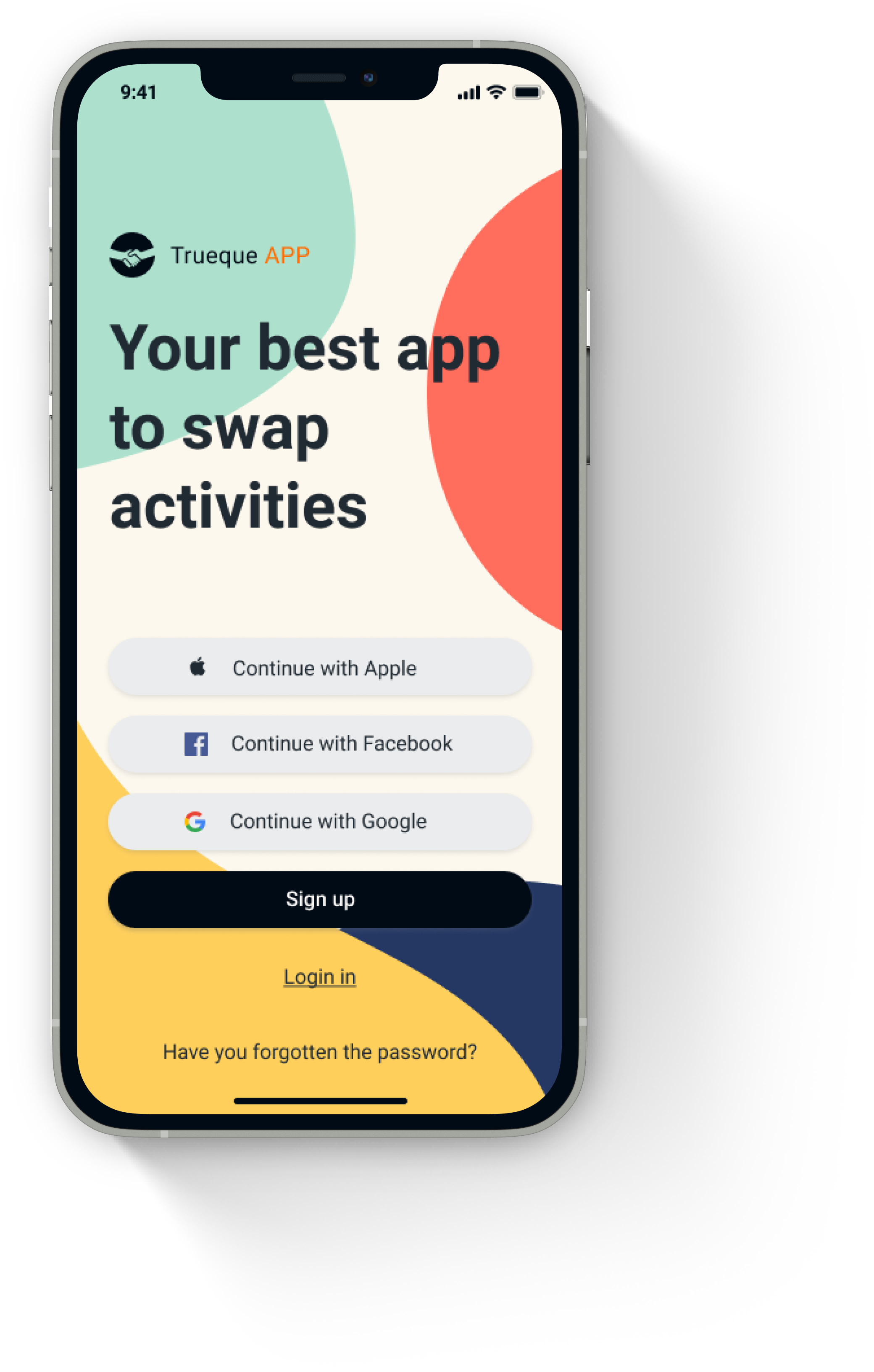
Easy Use
The age difference of the project is huge, so it is essential to make a structure that everyone can understand and effortless.
Data storage
Sometimes you won’t have time to enjoy your trueque, therefore, the structure should have a place where you can access it later.
Channels
Establish different forms to share the contents and promote the interaction between the users to begin a community.
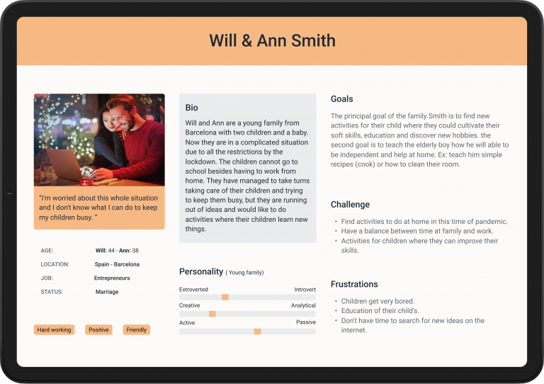
User Personas
We spent most of the first day pitching our ideas to each other and brainstorming new solutions. We had a few extreme idea switches before finally choosing one that we all believed. We began to build a general user persona that includes all the needs of the moment and basic architecture for the product idea.
We proposed to create Trueque App – it is a perfect solution for the lockdown where the participant can swap experience in a simple way and stay in contact with the community.
Site map
With these core features in mind, we did a card sort to gain insight as to how users might expect the content to be organised and displayed on the platform.
Wirefrime
Low fidelity wireframes
Since simplicity and ease of use are one of the biggest aims of Trueque App. We started created multiple versions of each screen until I found a combination of features and elements that we thought matched the users needs and that would be as intuitive as much as possible.
High fidelity
Based design
We made changes based on the user feedback from the prototype and anothers designers. We created a newer, high-fidelity version of the app that featured more white space, larger icons and clearer text.
To this design, I applied the Gestalt Principles, colour theory and made use of grids to ensure consistency within the entire app.
Design System
Language
We made changes based on the user feedback from the prototype and anothers designers. We created a newer, high-fidelity version of the app that featured more white space, larger icons and clearer text.
To this design, I applied the Gestalt Principles, colour theory and made use of grids to ensure consistency within the entire app.
Color Palette
Since simplicity and ease of use are one of the biggest aims of Trueque App. We started created multiple versions of each screen until I found a combination of features and elements that we thought matched the users needs and that would be as intuitive as much as possible.
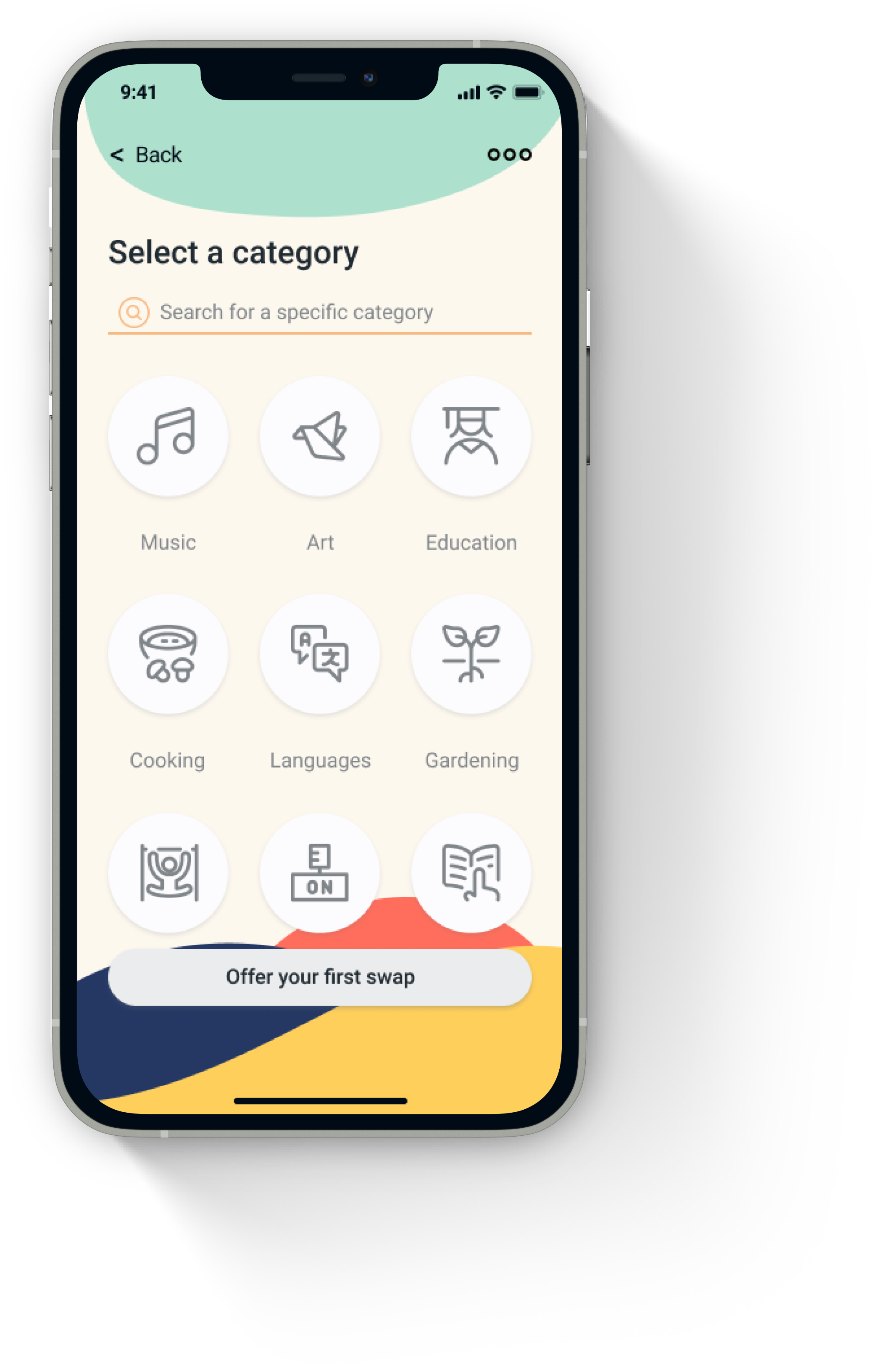
Iconography
Icons should be used in order to communicate or enhance an action. They should be designed and used with purpose with the aim to assist.
For this project, we have chosen to use the library “Streamline icons.” It is one of the most complete icon libraries on the market and giving us many options to represent the functions of the app.
Typography
Trueque’s typography aims for minimalism and organic design.
The app uses Roboto font in all content within the app. Make use of bold for headings, and use sparingly for emphasi.
Grid
5 column grids should be applied in order to improve the consistency of elements on each screen.