


My ireland tour
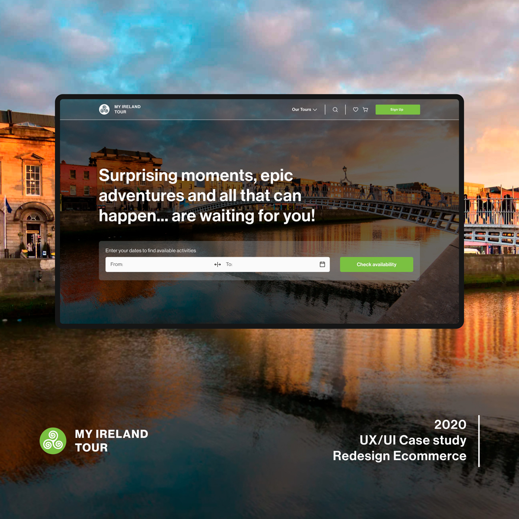
My Ireland tour is an independent family business based in Cork. They offer a range of Ireland tour packages as well as their bespoke private tours. where they show you what makes Ireland such a magical place.
Task
Design a new web architecture and floats to improve purchase statistics
-
Strategy
Brand, UX Research, Management
-
Design
UX/UI Design, Prototyping
-
Client
My Ireland tour
What's "My Ireland Tour"?
My Ireland Tour is an independent family business based in Cork. They offer a range of Ireland tour packages as well as their bespoke private tours where they show you what makes Ireland such a magical place.
The project focuses on the development of an e-commerce website that helps the user/client to book a group or private tour. In addition, the website needs other components to make a better experience, such as: the newsletter section, establishing a new information architecture and an administration section (back-office) where the client can reserve all the activities of the season or special promotions that have been designed based on your tastes or previously chosen specifications.
Benchmark
My first step was to conduct competitors’ research. Evaluate all their pros and cons, define typical user flow and analyze their features. I found 8 direct and indirect competitors.
Discovered benefits of competitors that can be used in our site.
Main page and whole site
- Product categories are sorted by gender, occasion, special offers, product type, etc.
- "Sales special for you" block.
- Subscribe for a special offer block.
- Mini product catalogue ( new arrivals, bestsellers).
- FAQ block.
- Instagram or any social media (also good idea is to launch Instagram hashtag to make people post under it).
- Button for online and phone contact.
- Site map placed in the footer.
Cart and checkout
- Product categories are sorted by gender, occasion, special offers, product type, etc.
- "Sales special for you" block.
- Subscribe for a special offer block.
- Mini product catalogue ( new arrivals, bestsellers).
- FAQ block.
- Instagram or any social media (also good idea is to launch Instagram hashtag to make people post under it).
- Button for online and phone contact.
- Site map placed in the footer.
After order checkout is complited
- Product categories are sorted by gender, occasion, special offers, product type, etc.
- "Sales special for you" block.
- Subscribe for a special offer block.
- Mini product catalogue ( new arrivals, bestsellers).
- FAQ block.
- Instagram or any social media (also good idea is to launch Instagram hashtag to make people post under it).
- Button for online and phone contact.
- Site map placed in the footer.
Product Card
- Product categories are sorted by gender, occasion, special offers, product type, etc.
- "Sales special for you" block.
- Subscribe for a special offer block.
- Mini product catalogue ( new arrivals, bestsellers).
- FAQ block.
- Instagram or any social media (also good idea is to launch Instagram hashtag to make people post under it).
- Button for online and phone contact.
- Site map placed in the footer.
Catalog Page
- Product categories are sorted by gender, occasion, special offers, product type, etc.
- "Sales special for you" block.
- Subscribe for a special offer block.
- Mini product catalogue ( new arrivals, bestsellers).
- FAQ block.
- Instagram or any social media (also good idea is to launch Instagram hashtag to make people post under it).
- Button for online and phone contact.
- Site map placed in the footer.
Architecture & flow
The reorganization of the content of the website was the main step to understanding how the information should be presented to create a platform where the user can find what they need without wasting time or getting lost.
Wirefrime
Mid-Fidelity Wireframes.
The next step was to adapt the previous information to the different devices ( Pc, Movil, Ipad, etc) and discover all the possible interactions that a user could experience on the web.
High fidelity
New design
We made changes based on feedback from prototype users and other designers. We created a newer, high-fidelity version of the platform that featured more whitespace, better interactions with components, rearranged page sections based on business goals, and clearer text.
For this design, I applied Gestalt Principles, colour theory and used grids to ensure consistency throughout the application.
Link project
Design System
Language
A Design System is the single source of truth which groups all the elements that will allow the teams to design, realize and develop a product. So a Design System is not a deliverable, but a set of deliverables. It will evolve constantly with the product, the tools and the new technologies.
The System is composed of tangibles and non-tangibles elements :
- Tools for designers & developers, patterns, components, guidelines…
- But also -and it’s often the most difficult thing to achieve- some abstract elements such as brand values, shared ways of working, mindset, shared beliefs…
Color Palette
Given the simplicity and the ease and adaptability of the website. We started by creating a wide range of colors until we found a combination that respects accessibility and fits the needs of users and the company.
Iconography
Icons should be used in order to communicate or enhance an action. They should be designed and used with purpose with the aim to assist.
For this project, we have chosen to use the library “Phosphor Icons“. it is one of the best free icon libraries on the market and giving us many options to represent the functions of the ecommerce.
Typography
Grid
The structure of this product digital is divided into two versions: In desktop which grid settings must be 12 columns and Mobil is 4 columns